The challenge
October is over and so is the Legal Design Inktober challenge. The first thing we want to do is thank everybody that took part in the challenge. We tried to closely follow your contributions and loved them all. If you didn’t have the chance to participate or don’t know what we are talking about so we are going to quickly explain it.
Inktober is an initiative created by the ink artist Jake Parker back in 2009 his goal was to improve his “inking skills and develop positive drawing habits”. Since 2016, there is an official list, one for each day for October, with general topics about what to draw. You can approach the challenge as you want, making it daily, every 2 days or once a week, as long as you are consistent with it. At the end of the challenge, you will see how your skills improved.
Using the premise from Inktober, at Visual Contracts we decided to create our own challenge, Legal Design Inktober. Our goal with this initiative was to motivate people to start drawing legal content, to inspire each other and to mobilize more designers and lawyers to join our legal design community and contribute to a better and understandable law. So every day during the month of October we published a topic related to the legal field and your task was to make a drawing/visualization about it. You didn’t need to have any drawing skills to take part it in it and you could make your visualizations in any means you found comfortable to draw in paper, napkin, digital, etc. The next step was to share it in our of our social media channels either Twitter (@LegalDT ) or Instagram ( @visual_contracts ) using the hashtag #LegalDesignInktober.
List of topics
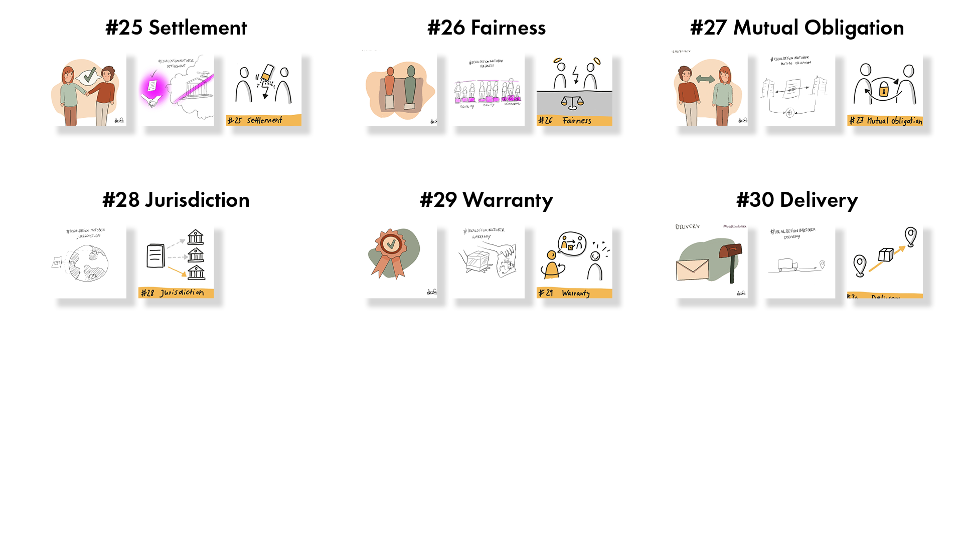
It’s never too late so if you didn’t get the chance to do it in October or you are just now learning about it you can still do it and share it on Twitter or Instagram using the hashtag: #LegalDesignInktober. Here is the complete list of the topics:
|
|
|
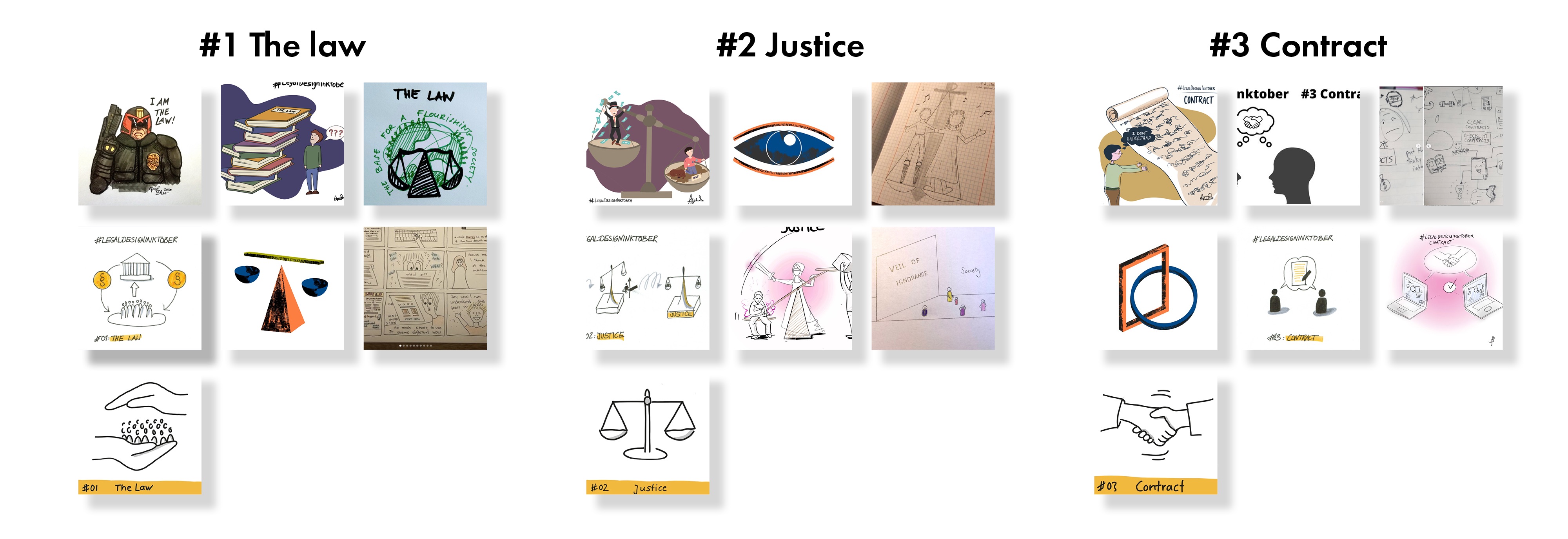
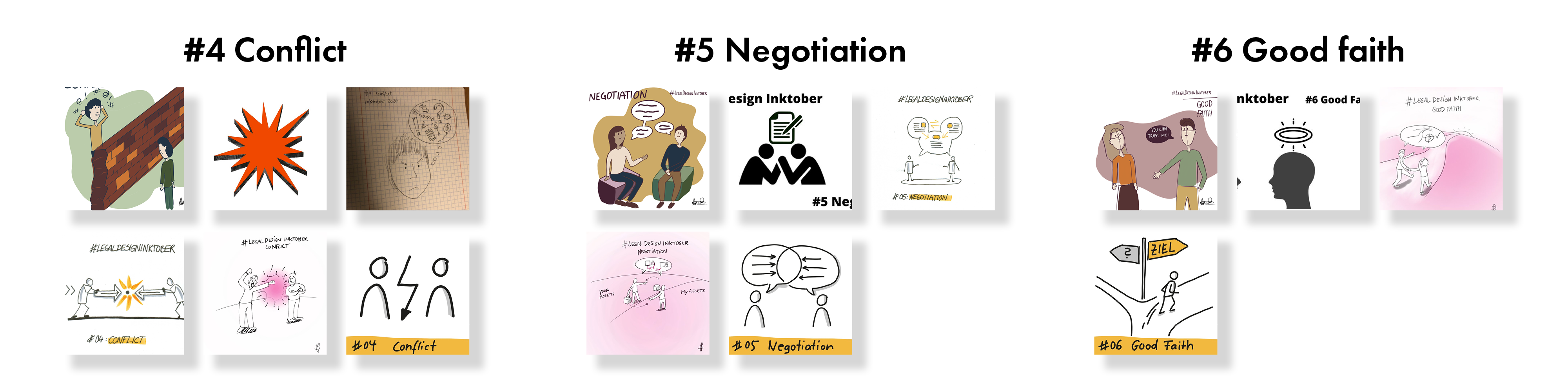
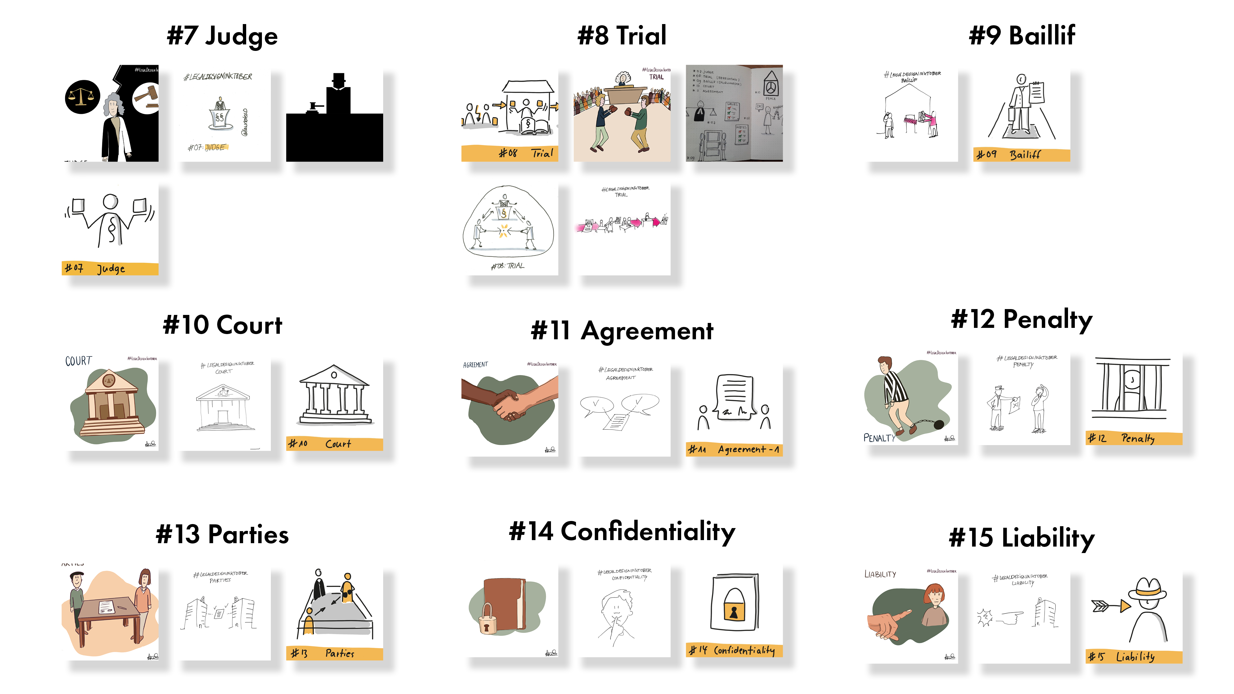
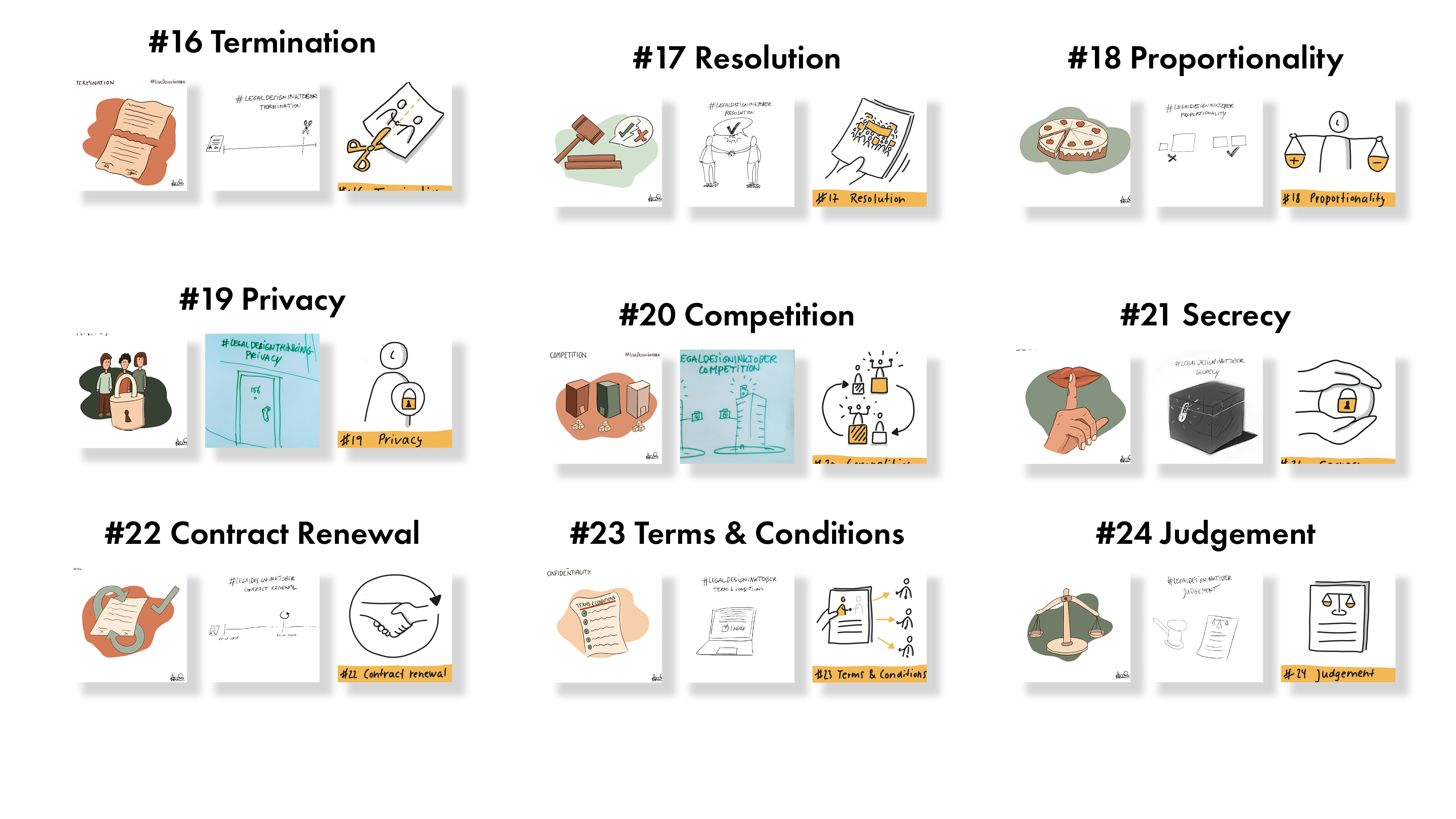
Overview of visuals
After the challenge was over, we gathered all your designs and we created this overview. It was very interesting to see the different styles and interpretations you had per topic. At the end of the article there is a close up overview of the visuals.
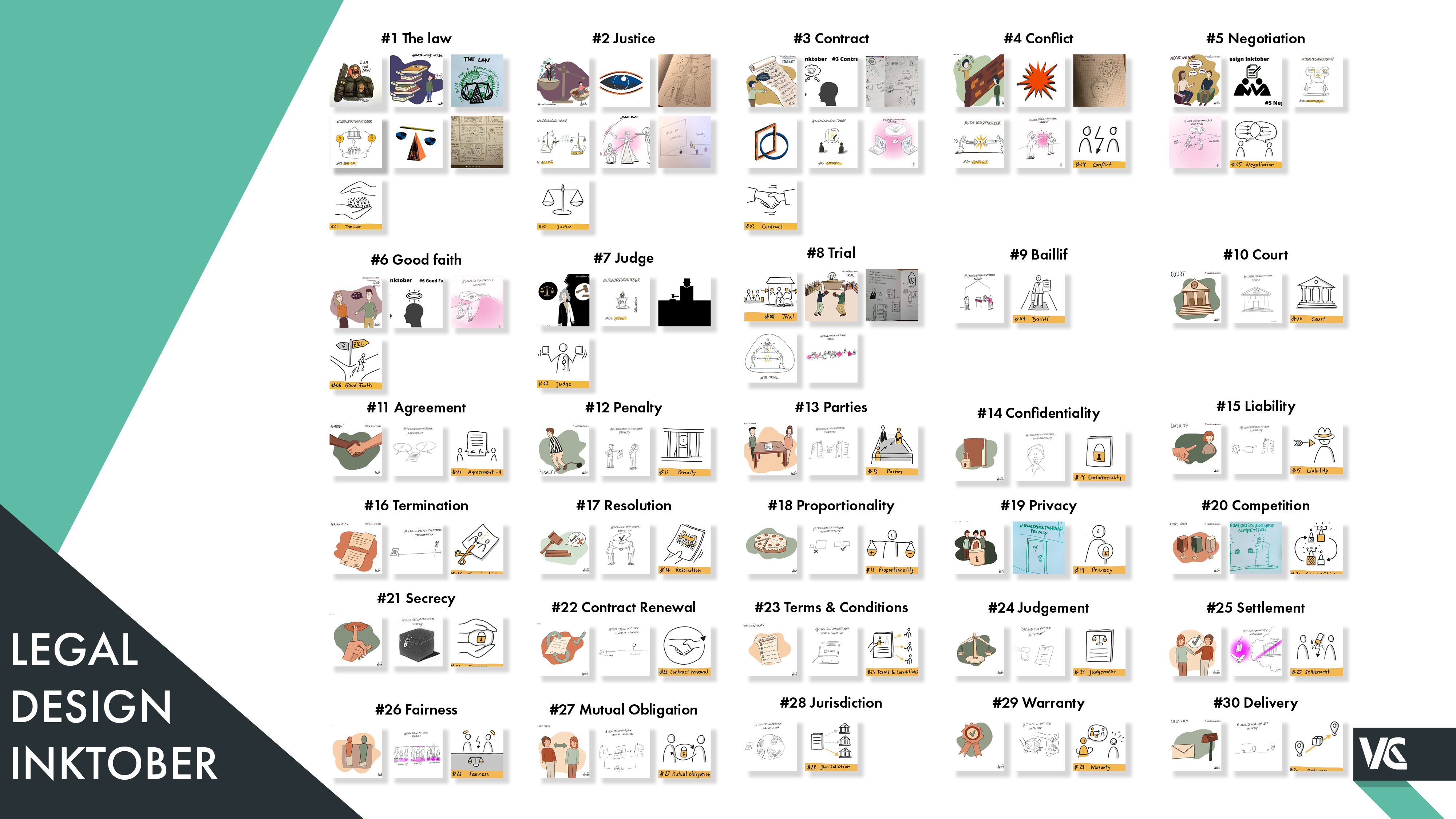
(Click on the image to zoom in)
We wanted to make a special remark on the work of Nicola Pridik (@NicolaPridik on Twitter) who really impressed us with her take and attitude on the challenge. All her drawings showed a consistent use of colour and style, using shading. In order to communicate a message as clear as possible, she only included the essential elements and used colour (yellow) to highlight specific elements giving hierarchy to the image. The use of simple lines and shapes combine with a light shading gave a bit of depth and contrast to the image. She wrote this article in German, explaining her experience on the challenge which was very insightful and contributed to our own refection and analysis of your contributions.
Classifying your visualizations
We took a closer look at all your contributions, as we could see that there were very different interpretations of the same topic, although the general context, legal, was the same. This led us to a more in-depth analysis form the meaning perspective. We categorized the visualizations into 4 categories. Our goal was to create some general understanding of what is it more effective when visualizing information in the legal field, to use the legal context or to use the context in which the field was applicable.
Cultural References
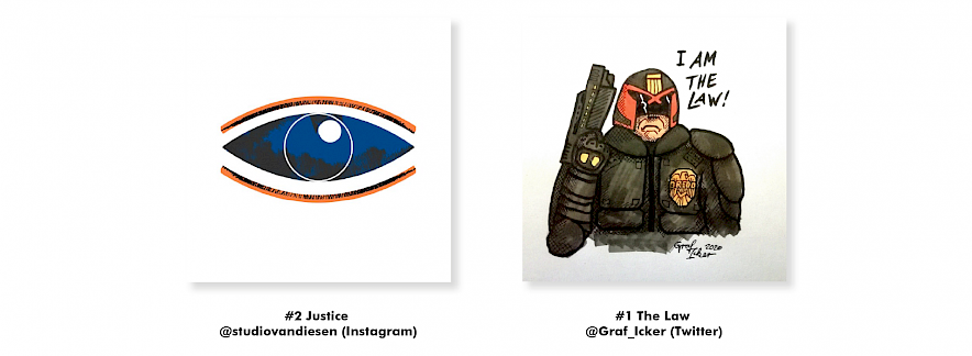
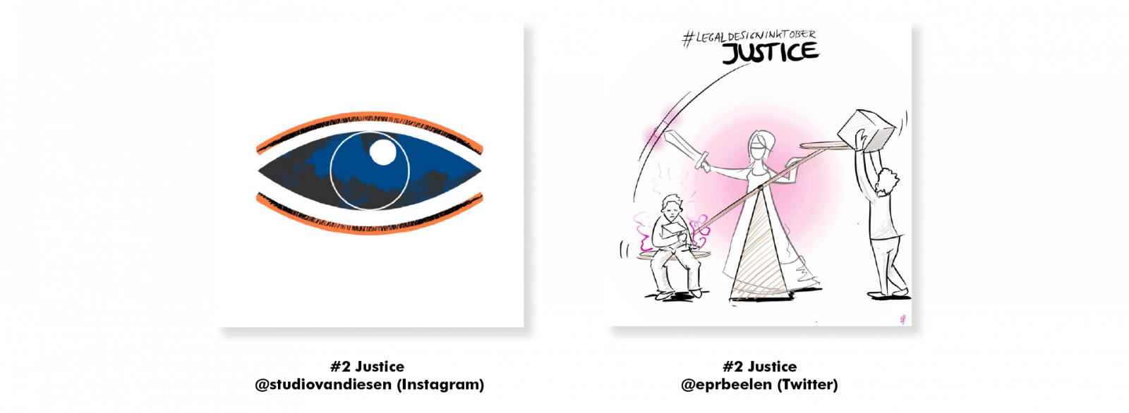
Cultural reference visualizations are linked to the popular culture and it is necessary to have specific knowledge on it to understand what they represent. These type of visuals only are appropriate to use if there is a certainty that the audience is familiar with this reference. It is the case of the visualization from Jeroen van Diesen, who represents the topic “#2 Justice” as the providence eye, which belongs to God who is watching over humanity. In the case of Graficker (@Graf_Icker on Twitter), he uses a reference from the popular movie Dredd, a movie ambience in a dystopian world in which police officers claim to be “The Law”.
Literal meaning (Legal context)
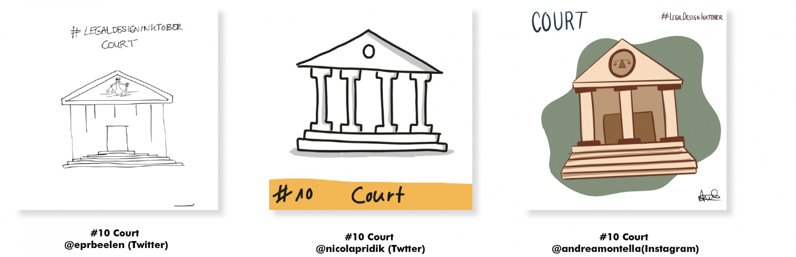
These types of visualizations show the topic in the most literal meaning. As you can see with the topic “#10 Court” all the participants had a similar association on how to visualize it. In this case it is strictly related to the legal context. Because it is also visualizing tangible objects. Therefore, you can use this type of visualization when the terms or topics are more concrete. Another example is the topic “#7 Judge”, where most participants have a person in mind. This is a great example to reflect on the different visualization styles and see which one communicates the topic most clearly and how these styles elicit different experiences and emotions.

Metaphors
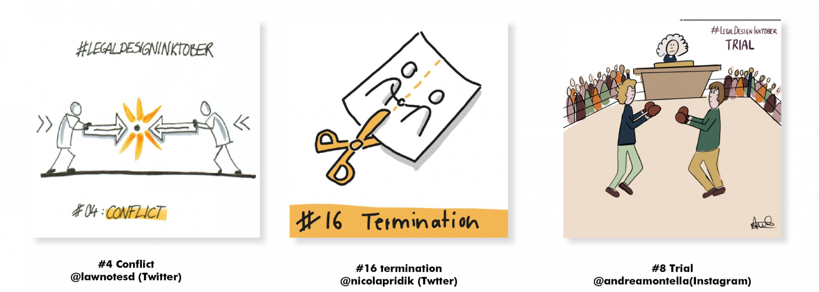
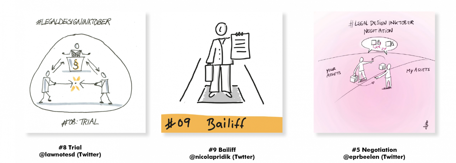
Metaphors are visualizations that use symbolic representation to convey the meaning or the intention of the topic. They use not legal-related elements that help the user to understand the more abstract legal topics using a different context. However, it is possible to tell there is a correlation between the legal topic and the context used in the visualization. For example, the boxing ring is used to make the relation towards the tournament model in the topic “#8 Trial”. In the case of the topic “#16 Termination” the traditional way of ending a contract by literally cutting a paper contract in two stands for the termination of any agreement. Finally, the visualization on the topic “#4 Conflict” represent the tension in a conflict as an explosion symbol that we all recognize from cartoons. The question is still how intense the conflict is and if violence would be involved or not, but the image clearly communicates that something wrong is happening.
Abstract Interpretations
These types of visualizations show meaning in an abstract way. The best example of this is the visualization from Jeroen van Diesen (@studiovandiesen on IG) about the topic “#3 Contract” which makes use of a square and a circle as a way to represent the connection of two parties. Another example would be the topic of “#6 Good Faith” from Brian Tang (@CapMarketsProf on Twitter) where you see he took a different approach than the other participants who visualized a more realistic representation of good faith while Brian focused on the angel halo above the heads of people to represent it. These visualizations are not directly related to the legal topic, therefore, when they are not accompanied by text it is difficult to make the correlation with the legal context.

4 take-aways from legal design inktober challenge
1. Simple drawings are effective
It is not necessary to have amazing drawing skills in order to communicate a message.With only a few lines you can communicate a whole legal concept. The visuals of Nicola Pridik show that very nicely. She used simple shapes, solid and clear lines which consciously vary in thicknesses and colour to highlight the most relevant elements. Next to that, she kept a consistent layout on the visualization with a label on the bottom to highlight the topic. As we know this is a proven methodology in Visual Thinking and shows to be an effective means for communication.

2. Different interpretations of the same topic
The classification of your visuals shows clearly that words without context can be interpreted in different ways. The fact that the given context, legal, is very broad also gives a big space for interpretation. Another factor that plays an important role is the variety of topics. While some topics are more abstract and open to interpretation, like justice and the law, others are more concrete and tangible, like court and judge. As you see in the visuals below the topic law is visualized in many different ways, because it is more abstract and from just the topic itself you don’t know what it refers to.

In the case of the visuals for court you all the participants taking the same approach.
3. The importance of context in legal visualizations
While visualizations can be interpreted in different ways when they are not put into context, the importance of context in legal visualizations themselves leads to more clarity in how to interpret the visual. As you see when visuals (or icons) are used without context they can be still interpreted in many different ways. Yet when more context is applied the room for interpretation decreases. The justice topic gives a good example on how including context helps to interpret the concept. Both visuals below represented justice, while the eye is a very symbolic way to represent justice, the visual from Lieke Beelen (@eprbeelen on Twitter) puts the icons that we are familiar with to life.
4. Include the user
Another element that is relevant and that can help users to understand is including the users/people as part of the visualization. This is the human-centred approach that is so relevant to make the law and justice more accessible to everyone. Including the role of users in action, helps them understand abstract and complex legal concepts better. Examples are the topic of negotiation, trial and bailiff where people are put very central in the image to explain the topic.
Our recommendation: always check with the user
The last note from our side is still to test your visuals always with your target group/audience. By means of testing and improving your design, you can come up with the right visual concepts and design detail that helps communicate the information that you intend to convey. Check out our trainings if you want to know more about users testing.
Overall conclusion
If we talk about visualization in the legal world it is important to combine visualizations with text and set it into the context to make sure that the user will interpret it as intended. Our #legaldesigninktober challenge also shows that only using icons is not enough and that it is necessary to visualize things more in context, combining real-world visualization with text. Our privacy statement is an example of how we apply this into an actual legal document.
Want to learn more about visual thinking in the legal context?
We are soon going to announce a visual thinking training specifically for the legal context. In this training, we will teach you the basic visual thinking skills, visual design skills and how this works in legal documents. Get updated on this via our newsletter, join our community or check our social media channels.
Visuals overview close-up